They say life is not always black and white, it’s a million shades of grey. But out of these million shades, choosing the right kind of grey that works for you and your interior is important. For grey, if we are to examine it from a more clinical perspective, is actually bereft of color. You’d argue that black and white, mixed together make grey but any color (whether a primary hue or as a result of combination)—inherently—has some personality attached to it; for example, yellow brims with upbeat energy or blue pulsates serenity.
However, grey, in that respect, is absent of color and therefore, does not draw attention to itself. You can ascribe it any mood or personality you want as it’s more of a thing of personal interpretation. But there are certain shades of this versatile yet mysterious hue that have, over years of usage, gained certain psychological associations enabling users to create an ambiance they are aiming for.
Here are some of our surface decors drenched in greys, which are our favorites and communicate a sophisticated vibe.
SCANDI-COOL AND CHIC
Cozy and cheerful, the (2418 Stone “S”) like the Scandinavian style, is full of homely warmth. The deeply textured panel in charcoal grey is an ideal way to play up the modern-sophistication-meets-hygge-comfort that the style represents. You can instantly create a warm, enveloping vibe in your interior with this embossed veneer from Holz in Form and as you can see here, the grey gives all #positivefeels
SCULPTURAL FINESSE
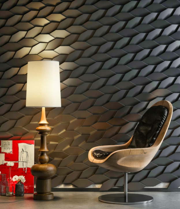
All those naysayers who thought that grey conveys nothing more than dull and dreariness will be forced to lose their smugness and become appreciative of its controlled nature. Grey can be dramatic and daring—just like Mabel, a 3D wall system comprising polygonal tiles that are placed in opposing directions to create a ‘jumping off your wall’ spatial effect. For an interesting dialogue between light and depth, these tiles in Silver, White, and Smoke will pep up your walls in a beat.
A COOL NEUTRAL
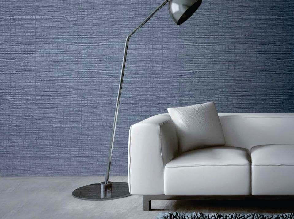
For those of us who are seeking a tidy and fuss-free definition of that coveted contemporary lifestyle—we are giving you a starting point to launch into action. Greys with a touch of blue, like this beaut from our Interart 9090 Ridgewood Latho Move series, has a nonchalant coolness to it which we totally approve of. This hue of grey works as a neutral—pulling together disparate design elements and resulting in a look that looks posh but not pretentiously precious. We are already imagining a laidback home office in this wall panel in delhi Ncr.
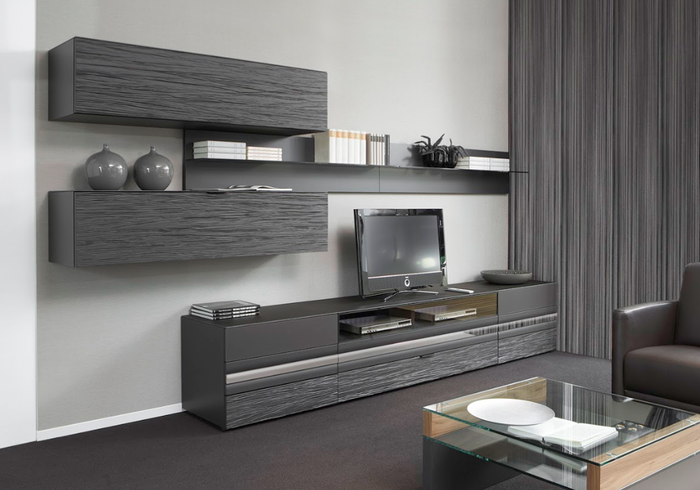
WORK IN CONTRAST
Grey might seem like an estranged member of the black and white family—but it sure does exhibit the characteristics these two strong colors are primarily used for, which is to work up the contrast. Enveloping the wall behind the TV unit is Grey Valchromat, a wood fiber panel impregnated with an organic dye. Acting as a vivid contrast to its calm energy is a bright sunny hue blanketing the frame of the TV unit’s niches.
We hope this blog post dispelled some of your common misunderstandings and concerns about grey. Let us tell you that we have a HUGE selection of surface decors in this versatile color. So why not pop into our store to see which one floats your boat?
Visit Ventura Architectural Experience Centre TODAY in 1/120, W.H.S, Kirti Nagar, New Delhi. You can also log on to our website venturaindia.com to view our wide range of products. For personal assistance, you can reach us on 91-11-45546700 and 1-800-103-6756 (toll-free).